I have a fresh coloring page for you that you won't find in any published book! Click below to start the download.
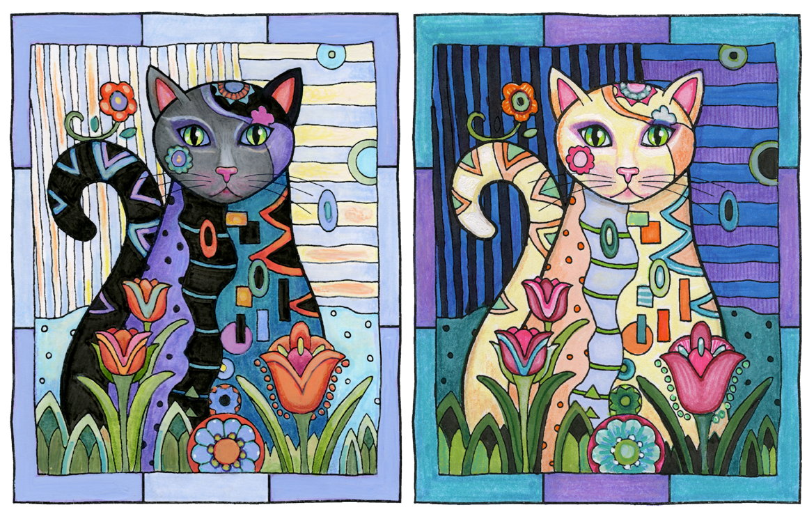
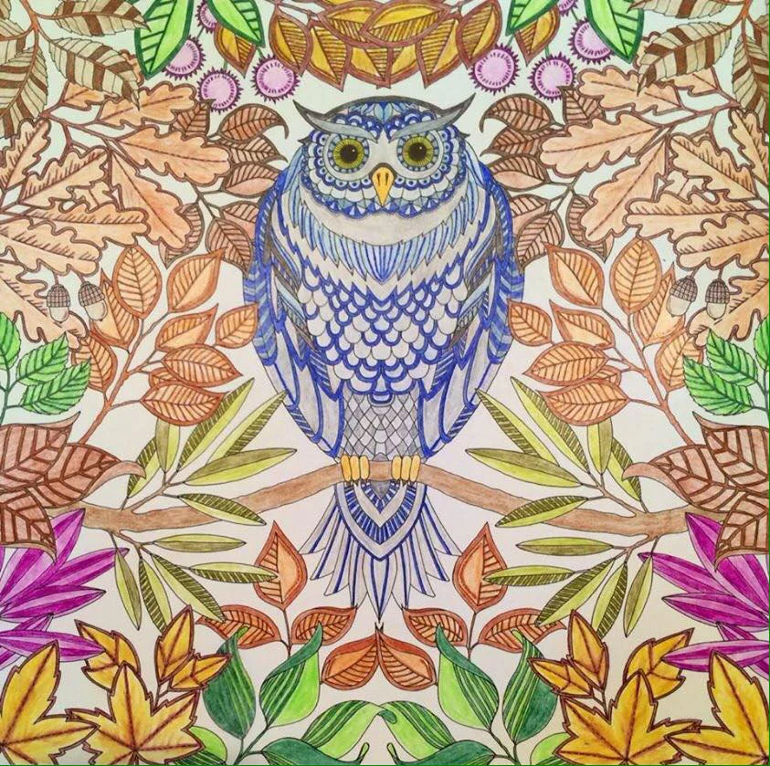
I recently offered this illustration to my Facebook group (you really should join if you haven't already), and members have created beautiful artwork from this page. The gorgeous example shown is by Nicole Ziobro. Each week we have a "color-along", and for this illustration I offered tips for coloring it. I hope this sparks some ideas for your Dreamy Unicorn.
Choose your own “dreamy” color palette to color the Unicorn artwork using any technique(s) you want. Think about what evokes fantasy or dreamlike colors to you. We often think of pale blues, violets, and other pastels to create a dreamy atmosphere. Disney used dark blue for the skies in his fairytales. Colors in rainbow sequence (red, orange, yellow, green, blue, purple) in backgrounds or on flowers add a dreamy accent. Rainbow colors can be pale versions (pink, peach, yellow, mint, light blue, lavender). Unnatural colors, such as blue daffodils or yellow skies give a dreamy feeling. Use whatever colors feel dreamy to you. Use any art materials — colored pencils, markers, gel pens, paint, glitter pens, and more.
Many Coloring Book Projects Lined Up

I haven't made a blog post in a while, only because I've been super-busy with more coloring book projects that I hope you'll enjoy. I just delivered the finished line art for Fanciful Sea Life, which will be published in February, next year. Now I'm putting the finishing touches on the four color illustrations that will appear in the book. Right behind that are three more coloring books to be announced.

"Tropical Fish" will appear in Fanciful Sea Life in February 2018.

Featured Artists
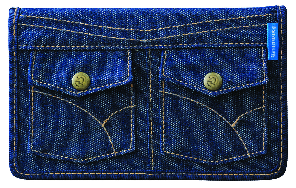
I'm honored that the October 2017 issue of “Pen World” magazine features me and Johanna Basford as coloring book artists who find Staedtler products to be essential tools in our work.
I love color and texture and layering detail in my artwork. Since reviewing Staedtler pens last year, I’ve used them exclusively for a variety of techniques because they’re so versatile. You can read about how I use triplus fineliners and pigment liners in my artwork, and how Johanna depends on Staedtler products in the story, "Triple Threat."
I'll have more to share with you very soon. In the meantime, thank you for your support of my artwork.
Color your days in positive ways!


