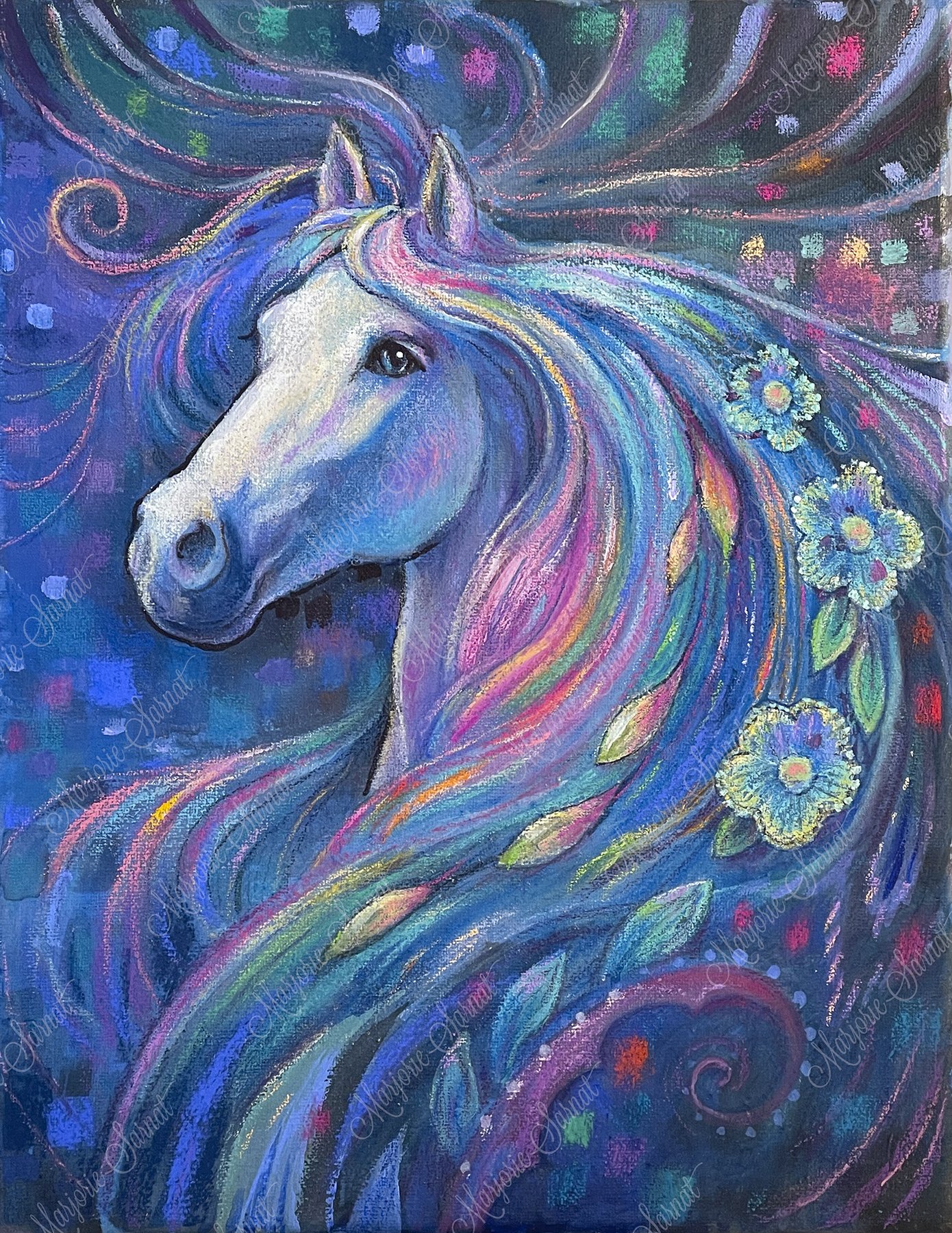
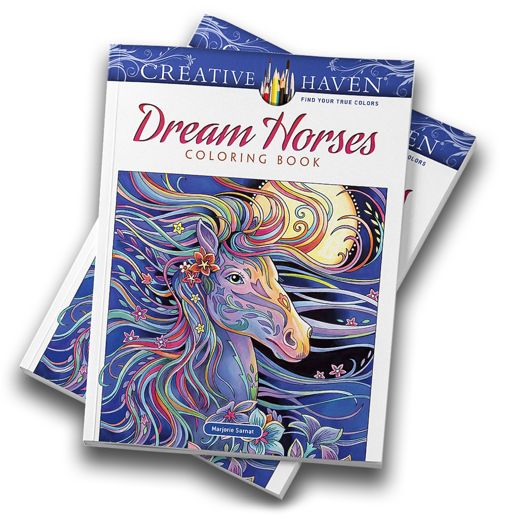
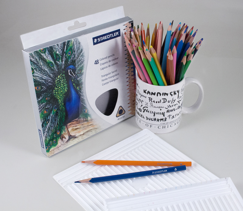
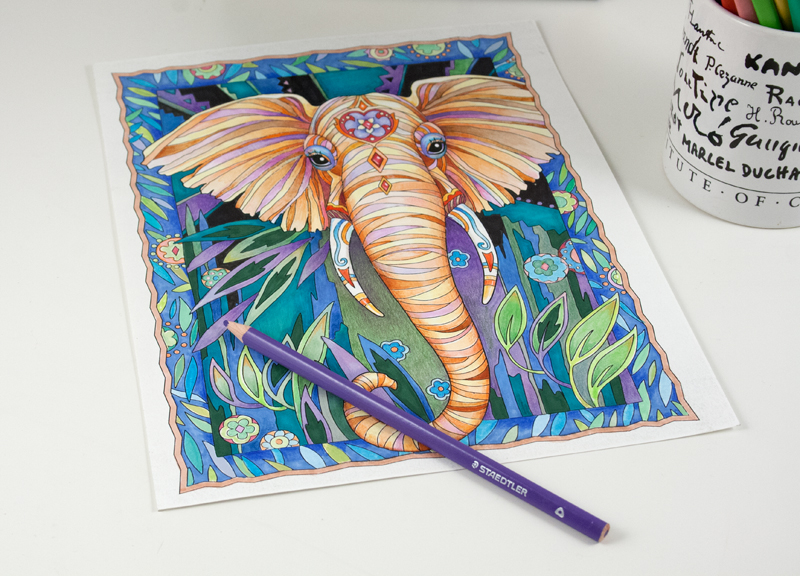
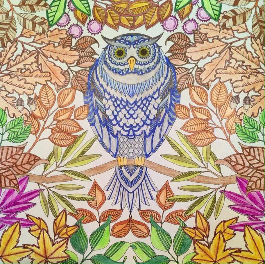
My Creative Haven coloring book, Dream Horses, features a horse on the cover with a colorful flowing mane. I used colored pencil, marker, and gouache for that piece. I wanted to create a similar looking portrait with the soft effects and shimmering color that’s achieved by using pastels. Pastels can be challenging because of the powder dust and delicate surface of a pastel painting. Also, the “tooth” of the substrate can affect the ultimate look of a finished artwork. I enjoy working on stretched canvas, but it's not an ideal surface for pastels. So I experimented just for fun.
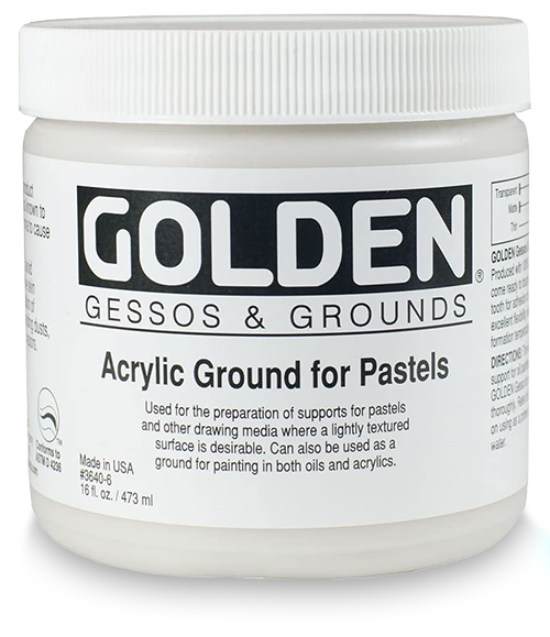
I used a medium called Golden Acrylic Ground for Pastels that prepares a canvas for pastels because it provides a gritty tooth that grabs and holds the pastel and chalk. I planned my Pastel Horse portrait by creating an underpainting in acrylics on canvas. After it dried I coated it with the acrylic ground, and finished it with pastels. These are the steps:
I added gesso to the back of my stretched 11 x 14 canvas to make it stiffer.
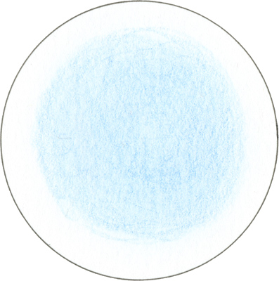
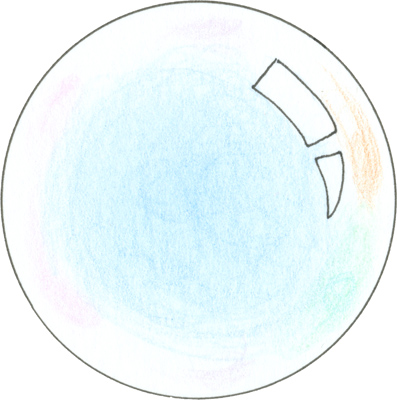
Then I created an underpainting in acrylics, using monotone blues so that I could resolve the lights and darks before adding color to the piece. Other monotone colors would work well for this step, too.
When the underpainting was thoroughly dry, I coated the surface with a clear Golden Acrylic Ground for Pastels. I diluted it with water so it flowed evenly. https://bit.ly/3KTYnSp
When that was dry I found I wanted to add second coat to increase the tooth of the surface.
When the second coat was dry, I put a dark acrylic wash over some areas to increase the range of values of my underpainting.
When the wash was dry I had fun using my chalk pastels, exploring various techniques and layers of color.
I drew some thin marker lines here and there for emphasis.
Next I continued layering, blending, and adding color accents with the chalk pastels until the finish.
I didn’t spray the piece with workable or final fixative at any point along the way, although some pastel artists believe it’s essential to keep the color adhering to the surface. I will try fixative in a future piece.
I’m pleased with the vibrancy of the pastel portrait which resulted from applying the three different art materials—acrylic paints, acrylic ground, and pastels—and choosing to work on canvas, which I’m very comfortable with. One of the advantages of working on stretched canvas is that the wood frame allows it to stay secure on an easel (rather than having to work on a drawing board.) I like to be able to stand back and observe my work in progress. A second advantage is the ability to do a very washy and painterly underpainting without worrying about warping or the surface breaking down.
Stay tuned: I intend to continue exploring the possibilities of pastels on canvas.


